As a website designer, I am always looking for the latest and greatest ways to take my designs to the next level. I am always learning from others and over the years, I have learned some pretty neat ways to spice up a website. So I thought I would share 5 with you here.
1. Keep it simple
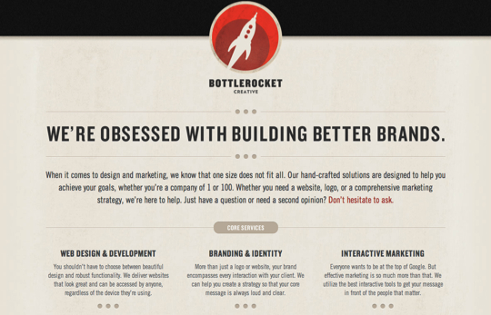
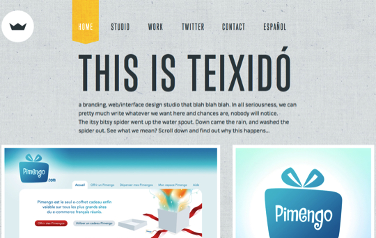
A lot of the time, we are tempted to overcomplicate our website designs. Websites with lots of content areas and complicated layout designs often give the allusion of being more legitimate or official than a more simplified concept. The most important concept however, is to be mindful of your audience. A more simplified design layout allows your reader to find what they are interested in fast and efficiently. That means not having to read through a lot of content, navigate blindly around your website or get distracted by content in which they are not interested. Here are some examples of great simple website designs.
Bottle Rocket Creative
Teixido
2. Make use of texture
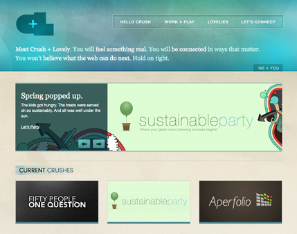
Texture is a great way to spice up any website design. Often times texture is a great way to break up large areas of a flat color or just a great way to add a little bit of added interest to an element. For a long time, texture was very absent from website design and to me, this is really what separates a great modern website from an older, outdated one. I am a fan of the “smart” use of texture and using it sparingly. As with most design techniques, it can be overdone. Check out some of my favorite websites that make great use of texture.
Alpine Meadows
Crush Lovely
rxbalance
3. Typography is key
Typography is a not only one of the keys to great website design, but it is also a very specialized skill. It takes a keen eye for design as well as the creativity to combine different font faces in a pleasing way. Good typography also makes intelligent decisions when choosing font sizes and spacing across the page. Careful attention to typography is easily overlooked, but when done correctly, it makes for some really great and attractive designs. See some of my favorites below.
Rainfall Daffison
kylemkramer
blakeallendesign.com
4. Don’t be afraid of white space
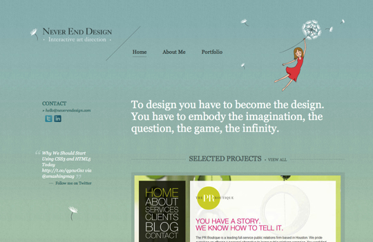
White space is often overlooked in website design, but is absolutely critical in achieving harmony and balance in your designs, as well as optimal readability of content. Web content needs a little room to breathe. Readers and visitors do not often realize the importance of white space until it isn’t there. It is our jobs as designers to know how to harness this power. Here are some examples of using white space thoughtfully and creatively.
six11ink
Never end Design
5. Look for inspiration
I look for inspiration before I start any design project. Often times this is looking at my client’s competitor’s websites or simply other websites that I like. I feel that it is an important part of the design process and one that keeps me sharp. I like to see what other innovators are doing in the field and most of the time, this is how I learn and improve my techniques. A good designer should never stop learning and never be short on inspiration.
